
Building a Color Picker Component

Introduction
Marko makes building UI components extremely easy and fun! Today we are going to build a color picker component from scratch. We are going to learn how to:
- Create a project using marko-cli
- Create a basic and customizable color picker component
Our final goal for today is create this component:

Getting Started
The quickest way to get up and running with Marko is to use the @marko/create cli.
For this tutorial lets tell @marko/create to give us a basic boilerplate by running the following command:
npx @marko/create --template basic --name color-picker-tutorial
Once the create command has finished, we can move into our new directory and get a development server up and running like so:
cd ./color-picker-tutorial
npm run dev
This should open your default browser automatically.
Creating Components
NOTE: For a more detailed documentation of components, please see the markojs.com components documentation
In our new project, components are located in the color-picker-tutorial/src/components/ directory. Next we need to create our component in the components/ directory, which should look like this:
color-picker-tutorial/
  src/
    components/
      color-picker/
        index.marko
Marko also supports creating components using the file name. For example, the following is a valid directory structure:
color-picker-tutorial/
  src/
    components/
      color-picker.marko
Creating nested component directories is not required, but we recommend isolating most components in their own directories. Many components will contain additional files and tests that live alongside the component. Too many components living in a single directory will become very untidy and difficult to manage.
Let's begin by adding some initial component code to the color-picker.
components/color-picker/index.marko
<ul>
  <for|color| of=input.colors>
    <li style={color: color}>
      ${color}
    </li>
  </for>
</ul>
ul
  for|color| of=input.colors
    li style={ color: color } -- ${color}
input in a Marko component is the input data that is passed to the component when it is being rendered. Let's modify our index route to demonstrate how a parent component can use our color-picker:
src/pages/index.marko
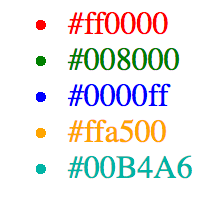
<html>
  <head>
    <title>Welcome | Marko Demo</title>
  </head>
  <body>
    <h1>Welcome to Marko!</h1>
    <color-picker colors=[
      '#333745',
      '#E63462',
      '#FE5F55',
      '#C7EFCF',
      '#EEF5DB',
      '#00B4A6',
      '#007DB6',
      '#FFE972',
      '#9C7671',
      '#0C192B'
    ]/>
  </body>
</html>
html
  head
    title -- Welcome | Marko Demo
  body
    h1 -- Welcome to Marko!
    color-picker colors=[
      "#333745",
      "#E63462",
      "#FE5F55",
      "#C7EFCF",
      "#EEF5DB",
      "#00B4A6",
      "#007DB6",
      "#FFE972",
      "#9C7671",
      "#0C192B",
    ]
Our dev server will indicate that the changes are being compiled and our browser will refresh for us once the process completes. The page should now display an unordered list with list items for each of the colors that we passed as input to our component.
Child Components
We've created our first component! This component will eventually have nested components. When creating components, it's strongly recommended to consider how components can be broken down into multiple components. Each component can then be independently developed and tested.
Let's split our component into the following components:
<color-picker-header>: The header will have the selected background color from the color picker and show the selected color's hex value

<color-picker-footer>: The footer will contain a palette of colors and an input field for changing the hex value of the header

<color-picker-selection>: The selection component is responsible for displaying an individual color box and handling the associated click events

Marko automatically registers all components in nested components/ directories. Our new directory structure should look like this:
components/
  color-picker/
    index.marko
  color-picker-footer/
    index.marko
  color-picker-header/
    index.marko
  color-picker-selection/
    index.marko
Let's start with with the <color-picker-header> component. We've already determined that the header should have a specific background color and display the value of that background color in text. The color to display should be passed in as part of the input.
src/components/color-picker-header/index.marko
// Inline styles!
style {
  .color-picker-header {
    width: 200px;
    height: 100px;
    border-radius: 20px 20px 0 0;
    font: 30px Arial;
    display: flex;
    flex-direction: column;
    text-align: center;
    color: white;
  }
  .color-picker-header > p {
    padding-top: 1.15em;
    margin: 0;
  }
}

// In Marko, we immediately start writing a single JavaScript statement by using
// `$`. For multiple JavaScript statements, use `$ { /* JavaScript here */ }
$ const color = input.color;

<!-- Our markup! -->
<div.color-picker-header style={backgroundColor: color}>
  <p>${color}</p>
</div>
// Inline styles!

style {
  .color-picker-header {
    width: 200px;
    height: 100px;
    border-radius: 20px 20px 0 0;
    font: 30px Arial;
    display: flex;
    flex-direction: column;
    text-align: center;
    color: white;
  }
  .color-picker-header > p {
    padding-top: 1.15em;
    margin: 0;
  }
}
// In Marko, we immediately start writing a single JavaScript statement by using

// `$`. For multiple JavaScript statements, use `$ { /* JavaScript here */ }

$ const color = input.color;
<!-- Our markup! -->
div.color-picker-header style={ backgroundColor: color }
  p -- ${color}
That's it! Our <color-picker-header> is complete with styles and component logic. This component is small enough to be contained in a single file, but as components grow larger, we should split out the markup, component logic, and styling. We will see an example of this soon.
Now let's look at what's going on. Marko has several lifecycle methods including onInput, which contains a single parameter input. As we discussed before input is the data that is passed to a Marko component upon initialization. We can use inline javascript easily with $ (for a single statement) or $ { } (for multiple statements), which is great for creating variables that can be accessed inside of your template. Additionally, single file components support inline styles, so the component can truly be contained as a single unit if it's small enough.
Now we need to revisit our parent component and add the <color-picker-header> tag to it, so it will be rendered.
src/components/color-picker/index.marko
class {
  onInput(input) {
    const colors = input.colors;

    this.state = {
      selectedColor: colors[0],
      colors
    };
  }
}

<div>
  <color-picker-header color=state.selectedColor/>
</div>
class {
  onInput(input) {
    const colors = input.colors;

    this.state = {
      selectedColor: colors[0],
      colors,
    };
  }
}

div
  color-picker-header color=state.selectedColor
Marko will automatically watch the state object for changes using getters and setters, and if the state changes then the UI component will be re-rendered and the DOM will automatically be updated.
We should now see the rendered <color-picker-header> with a gray background like so:
Now let's create the <color-picker-selection> component, which will be used inside of the <color-picker-footer>:
src/components/color-picker-selection/index.marko
class {
  handleColorSelected() {
    this.emit('color-selected');
  }
}

style {
  .color-picker-selection {
    width: 25px;
    height: 25px;
    border-radius: 5px 5px 5px 5px;
    display: flex;
    flex-direction: column;
    margin: 5px 0px 0px 5px;
    float: left;
  }
}

<div.color-picker-selection
  on-click('handleColorSelected')
  on-touchstart('handleColorSelected')
  style={
    backgroundColor: input.color
  }/>
class {
  handleColorSelected() {
    this.emit("color-selected");
  }
}
style {
  .color-picker-selection {
    width: 25px;
    height: 25px;
    border-radius: 5px 5px 5px 5px;
    display: flex;
    flex-direction: column;
    margin: 5px 0px 0px 5px;
    float: left;
  }
}

div.color-picker-selection [
  on-click("handleColorSelected")
  on-touchstart("handleColorSelected")
  style={
    backgroundColor: input.color,
  }
]
In this component, we've introduced on-click and on-touchstart listeners and a single event handler function. Marko components inherit from EventEmitter. When this color is selected, it will emit a click event and get handled by the handleColorSelected function. The handler then emits a color-selected event to be handled by its parent. We will eventually write code to relay this information back to the <color-picker-header>, so its background color and text can be changed.
We are ready to create our final component, <color-picker-footer>. This component is going to contain a bit more logic than the other components, so let's split it out into multiple files:
components/
  color-picker/
    components/
      color-picker-footer/
        component.js
        index.marko
        style.css
      ...
    ...
src/components/color-picker-footer/index.marko
$ const colors = input.colors;

<div.color-picker-footer>
  <div.color-picker-selection-container>
    <for|color| of=colors>
      <div>
        <!--
        Listen for the `color-selected` event emitted from the
        <color-picker-selection> component and handle it in this
        component's `handleColorSelected` method.
        NOTE: We pass along the `color` to the event handler method
        -->
        <color-picker-selection
          color=color
          on-color-selected('handleColorSelected', color)/>
      </div>
    </for>
    <input
      key="hexInput"
      placeholder="Hex value"
      on-input('handleHexInput')/>
  </div>
</div>
$ const colors = input.colors;

div.color-picker-footer
  div.color-picker-selection-container
    for|color| of=colors
      div
        <!--
        Listen for the `color-selected` event emitted from the
        <color-picker-selection> component and handle it in this
        component's `handleColorSelected` method.
        NOTE: We pass along the `color` to the event handler method
        -->
        color-picker-selection [
          color=color
          on-color-selected("handleColorSelected", color)
        ]
    input key="hexInput" placeholder="Hex value" on-input("handleHexInput")
In the <color-picker-footer> component we need to iterate over each color that was passed as input in colors. For each color, we create a <color-picker-selection> component and pass the color using the color attribute. Additionally, we are listening for the color-selected event emitted from the <color-picker-selection> component and handling it in our own handleColorSelected method. We provide the color as the second argument so that it will be available to the event handler method. We also have added an input field and a on-input listener, which will trigger a change to the selected color when the user manually enters a hex color value.
src/components/color-picker-footer/component.js
module.exports = class {
  handleColorSelected (color) {
    this.emit('color-selected', color);
  }
  handleHexInput () {
    let hexInput = this.getEl('hexInput').value;

    if (!hexInput.startsWith('#')) {
      hexInput = '#' + hexInput;
    }

    if (!isValidHexValue(hexInput)) {
      hexInput = this.input.colors[0];
    }

    this.emit('color-selected', hexInput);
  }
};

function isValidHexValue (hexValue) {
  return /^#[0-9A-F]{6}$/i.test(hexValue);
}
When the component logic is split out from the index.marko it needs to be exported like a standard JavaScript module. We have an handleColorSelected event handler, which is going to emit the event back up to the parent <color-picker-header> component. We also have an handleHexInput event handler with some basic validation logic. handleHexInput also emits color-selected, which will be handled the same way as the color-selected event when it reaches <color-picker-header>.
src/components/color-picker-footer/style.css
.color-picker-footer {
  width: 200px;
  height: 100px;
  border-radius: 0px 0px 20px 20px;
  font: 30px Arial;
  display: flex;
  flex-direction: column;
  text-align: center;
  color: white;
  box-shadow: 0px 3px 5px #888888;
}
.color-picker-selection-container {
  width: 75%;
  margin: 5px 0px 0px 20px;
}
.color-picker-selection-container input {
  margin-top: 8px;
  border-radius: 0px 0px 0px 0px;
  border-width: 0px 0px 1px 0px;
  outline: none;
  color: #A9A9A9;
}
We can now finalize our component! Let's revisit the parent <color-picker> component and add the <color-picker-footer>:
src/components/color-picker/index.marko
class {
  onInput(input) {
    const colors = input.colors;

    this.state = {
      selectedColor: colors[0],
      colors
    };
  }

  handleColorSelected(color) {
    this.state.selectedColor = color;
  }
}

<div>
  <color-picker-header color=state.selectedColor/>
  <color-picker-footer colors=state.colors on-color-selected('handleColorSelected')/>
</div>
class {
  onInput(input) {
    const colors = input.colors;

    this.state = {
      selectedColor: colors[0],
      colors,
    };
  }

  handleColorSelected(color) {
    this.state.selectedColor = color;
  }
}

div
  color-picker-header color=state.selectedColor
  color-picker-footer [
    colors=state.colors
    on-color-selected("handleColorSelected")
  ]
Finally, we've added our <color-picker-footer>, passed the state.colors as input to it, added a handleColorSelected event handler for the color-selected event emitted from <color-picker-footer>. When we handle this event, we update the state of the <color-picker> component, which is passed to the <color-picker-header>.
Congratulations! You have finished your first fully reactive Marko UI component!
Our finished product:
Now let's talk about some additional topics that will turn you into a Marko pro!
Importing Modules
Marko also supports importing modules. We can easily import a module using the familiar ES2015 import syntax for single file components.
Let's create a new helper module for generating the default colors:
src/util/getDefaultColors.js
module.exports = function getDefaultColors () {
  return [
    "#1ABC9C",
    "#2ECC71",
    "#3498DB",
    "#9B59B6",
    "#34495E",
    "#16A085",
    "#27AE60",
    "#2980B9",
    "#8E44AD",
    "#2C3E50"
  ];
};
We can import our helper module into the color-picker and use the generated colors as the default when none are passed as part of the input:
components/color-picker/index.marko
import getDefaultColors from '../../util/getDefaultColors';

class {
  onInput(input) {
    const colors = input.colors || getDefaultColors();

    this.state = {
      selectedColor: colors[0],
      colors
    };
  }

  handleColorSelected(color) {
    this.state.selectedColor = color;
  }
}

<div>
  <color-picker-header color=state.selectedColor/>
  <color-picker-footer colors=state.colors on-color-selected('handleColorSelected')/>
</div>
import getDefaultColors from "../../util/getDefaultColors";
class {
  onInput(input) {
    const colors = input.colors || getDefaultColors();

    this.state = {
      selectedColor: colors[0],
      colors,
    };
  }

  handleColorSelected(color) {
    this.state.selectedColor = color;
  }
}

div
  color-picker-header color=state.selectedColor
  color-picker-footer [
    colors=state.colors
    on-color-selected("handleColorSelected")
  ]
If we do not pass colors to the <color-picker>, the colors will default to the colors obtained our getDefaultColors helper.
Try Online: marko-color-picker
Testing
For testing Marko components we recommend using Marko Testing Library
Conclusion
Developing Marko UI components is fun and easy! As you're developing components, you should consider how a component can be split into multiple components. This makes developing, managing, and testing components significantly easier.
Marko gives you the tools to easily develop awesome UI components. Get started today!
Additional Resources
EDITSpecial thanks to Anthony Ng for helping with this tutorial!

Contributors
Helpful? You can thank these awesome people! You can also edit this doc if you see any issues or want to improve it.


